06
Sep
25
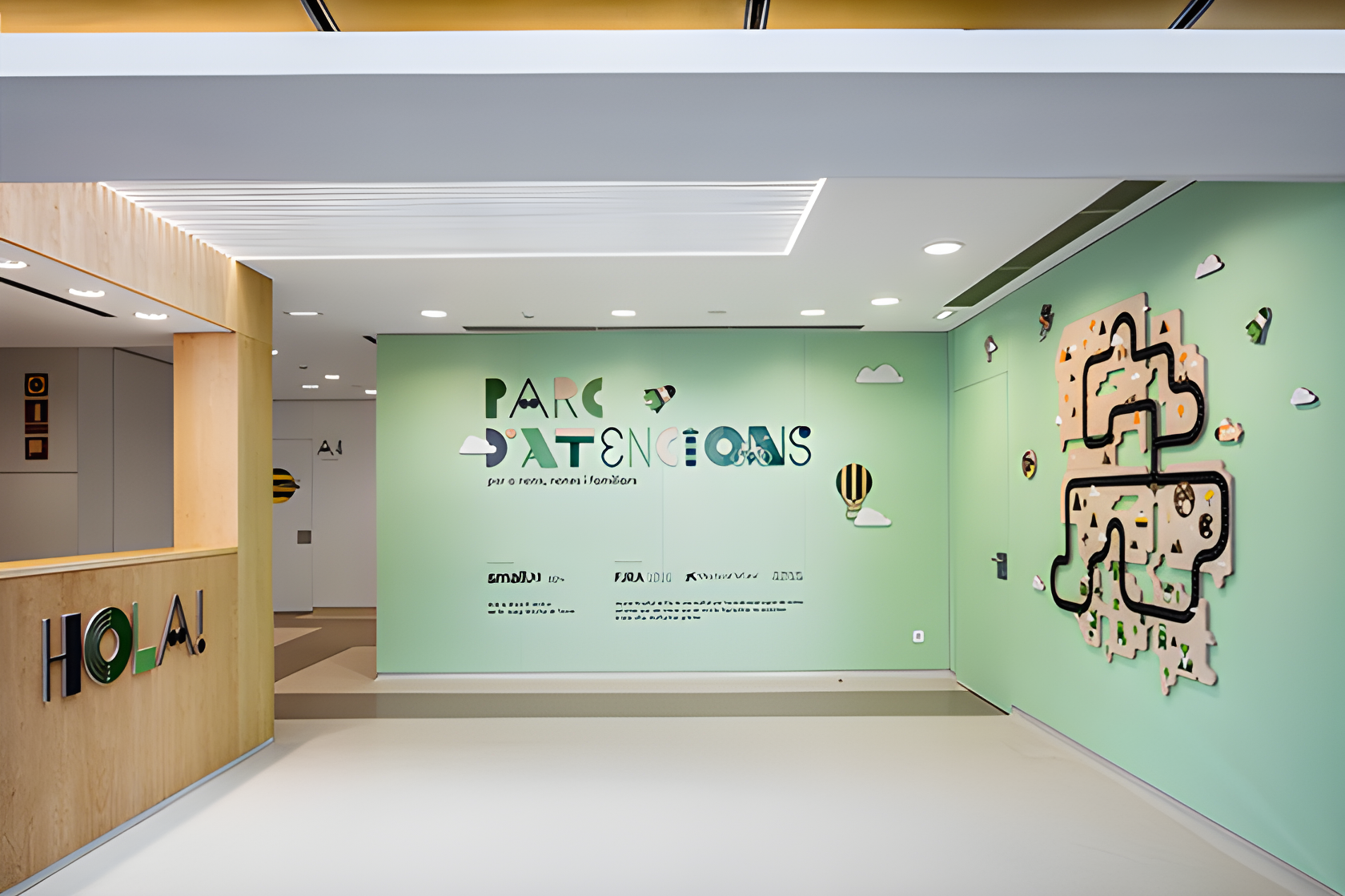
When Barcelona-based studio Toormix was asked to design the new children’s day oncology and hematology centre at Hospital Universitari Vall d’Hebron, they opted for a name that matters: “Parc d’Atencions” — literally “Care Park”. The choice plays with the Catalan idea of an amusement park, but pivots it: this is not about rides and thrills, but about care, attentiveness and human-scale empathy.
The narrative begins here. The brief wasn’t simply “make a hospital-looking centre.” It was “reshape a place of treatment into a place of experience” — for children, teens, parents and staff alike. In a setting that could so easily feel clinical and intimidating, the design team leaned into wordplay, atmosphere and environment. They divided the centre into three zones: Natural Environment (waiting), Universe (consultation) and Racing Circuit (treatment boxes) — each zone coded visually and experientially.
The Natural Environment zone is more than a waiting room. Picture wood-cut silhouettes of trees, mountains, owls on walls. Light is indirect, warm, calming. The Universe zone greets you with rockets, stars, even a UFO motif as you enter the consultation area. Then the Racing Circuit zone shapes the treatment area with the metaphors of speed, victory and progression.


From my own practice designing furniture and interiors, I know how tricky zoning can be when the user base is varied. Here, Toormix acknowledged that children, adolescents and adults all co-exist. That meant visual cues had to span ages — no infantilisation, no stark minimalism. They needed warmth, clarity, and a sense of hope. Wood panels, soft indirect lighting, natural textures—they all play a role.
Material choices feel inevitable once you see them: untreated wood, crisp graphics, soft colour palettes (greens, yellows, oranges). The identity and signage system were developed alongside architecture by Plasencia Arquitectura. The brand visuals aren’t an after-thought—they’re built into the space itself.


Branding is subtle: signage that children read easily, colours that guide but don’t overwhelm, decorative motifs that entertain but don’t distract. The design resists the “hospital chic” cliché. It respects the seriousness of oncology treatment but introduces humanity. From an interior designer’s standpoint, this is what differentiates a “nice hospital room” from a truly considered design intervention.
Designing for children is one thing. Designing for children, teens, parents and staff is another level. The waiting area contains table/co-work zones for grown-ups, pouffes sized for teenagers, play-hut styles for younger kids. Treatment areas intentionally avoid patronising décor by offering neutral textures and positive metaphors (such as victory racetrack).


I once visited a paediatric design project where everything screamed “child”. The teens felt alienated. Here the design acknowledges that spectrum of users. For me, this is a big takeaway: design gets richer when you map actual behaviour and blend it with environment—not just from aesthetic will. It becomes a tool of care.
From me, Evan Carter (yes, the slightly odd young designer who sits and sketches odd furniture at odd hours), here are some distilled lessons from Parc d’Atencions: design can be therapeutic. Branding must live in space. Materials speak volumes more than finishes. Zoning is emotional. And finally, the smallest details—light switch placements, seating height, wall-cut motifs—make the difference.
Creating a place of care: where visual identity meets emotional support.
If furniture design taught me anything, it’s that every surface is a conversation. In a medical environment, the stakes are higher—but so is the reward. We don’t always design for celebration. Sometimes we design for calm. For dignity. For people who need same design care as any luxury interior might demand.