19
Jun
26
We live in an incredibly visual culture where we judge the relevance of a physical retail environment almost entirely by how intuitive, vibrant, and structurally open it feels the moment we cross the threshold. When independent small businesses try to cultivate a dedicated local following, they often rely heavily on traditional nostalgia and historic charm. But as a designer who monitors how changing human behaviors interact with commercial brick-and-mortar spaces, I am deeply exhausted by the absolute lack of operational empathy found in old-school retail layouts. The traditional independent bookstore model, in particular, treats book merchandising with an almost religious attachment to clutter. We expect younger, digital-native generations to navigate dense, dark, and claustrophobic mazes of floor-to-ceiling wooden shelving units that completely block out natural light and stifle movement.
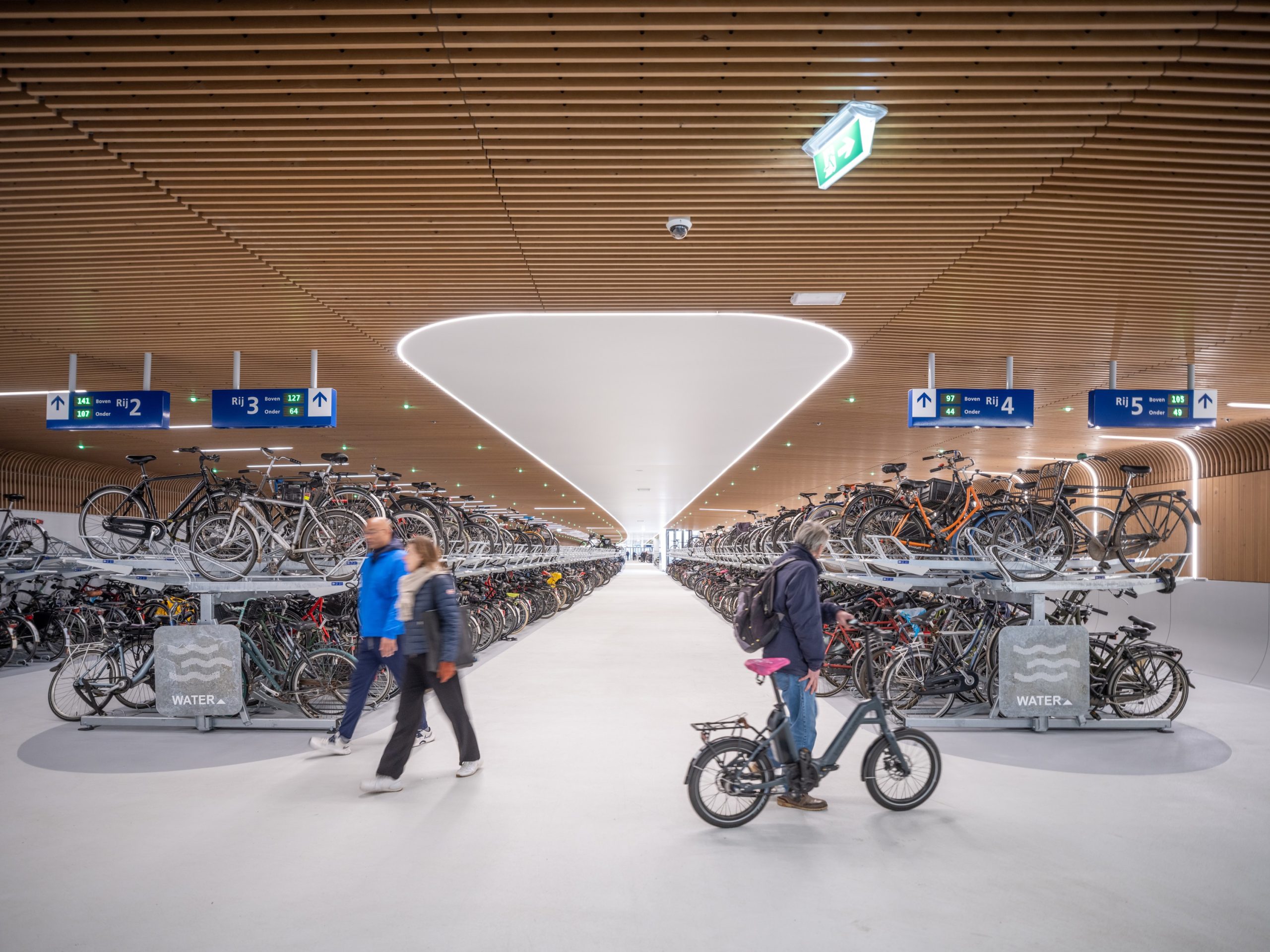
Think about the classic neighborhood bookshop. For decades, the default aesthetic has been dim, yellowing incandescent lighting, tightly packed aisles where two people cannot pass without bumping shoulders, and handwritten, faded cardboard section signs taped precariously to raw timber planks. For a modern consumer used to the seamless fluid navigation of digital applications, this environment feels less like an intellectual escape and more like an unorganized storage facility. This structural layout actively triggers choice paralysis and mental fatigue, driving away younger demographics who crave bright, scannable spaces. The small business sector has fundamentally failed itself by continuing to mistake passive spatial neglect for romantic historic heritage, completely ignoring the fact that confusing floor plans destroy impulse buying patterns and tank retail performance metrics.
Thankfully, a brilliant, highly pragmatic counter-strategy is unfolding directly within the urban neighborhoods of Chicago. A long-standing local bookstore has executed a radical, comprehensive brand transformation engineered specifically to break the dusty stereotype, utilizing bold, high-saturation color blocking and an advanced, intuitive spatial navigation layout. This is not a superficial face-lift meant to look trendy in an online style blog; it is a meticulously planned retail environment overhaul that has directly generated a staggering thirty percent increase in sales since its completion. What makes this independent project so profoundly compelling to me as a creator is how the designers treated physical colors as literal infrastructure.
The development team didn’t just repaint the exterior walls a bright shade or install a sleek neon logo behind the checkout counter. They engineered an entirely new physical wayfinding matrix where specific genres and community zones are mapped to distinct, high-contrast color palettes running seamlessly across the ceiling grids, custom metal fixtures, and flooring zones. While reviewing the intensive brand-identity guidelines, vector asset sheets, and markdown-formatted layout pitches sent over by the Chicago project consultants, I needed a way to strip out all the messy text formatting blocks to read the raw data numbers cleanly. I dropped the documentation folders into an online Markdown to Text converter tool. Running this process allowed me to instantly Convert Markdown formatted content into clean, plain text by removing hash headings, asterisks, and brackets, giving me unburdened access to the exact spatial dimensions and sales metrics. What this underlying data structural analysis uncovers is stunning: by using vibrant color paths to draw the human eye naturally through the space, the shop completely eliminated dead inventory corners.
Historically, whenever traditional retailers attempt to modernize their identity, they slide headfirst into an incredibly expensive, over-engineered trap. They fill their rooms with heavy digital screens, interactive tablet stations, and complex electronic tracking kiosks that require continuous software updates and break down constantly under daily consumer abuse. This hardware-heavy approach completely ignores the basic laws of retail ergonomics and visual psychology, resulting in massive technology maintenance invoices that drain the limited capital of independent shops while doing absolutely nothing to improve the physical flow of the space. True, generational modernization requires a completely opposite path: it demands structural simplicity, high-impact spatial layout mapping, and clean, bold typography that can be read effortlessly from across the store floor.
The true genius of this Chicago bookstore overhaul lies in its reliance on low-tech, high-concept architectural cues. The custom-fabricated powder-coated steel display tables are remarkably low-profile, keeping the entire sightline of the shop wide open from the front entrance all the way to the rear reading nooks. Instead of burying titles on deep, spine-out shelves, the fixtures are angled to prioritize face-out book merchandising, treating the vibrant covers of the literature as dynamic, ever-changing decorative elements. Large, high-contrast sans-serif directional words are stenciled directly onto the architectural bulkheads, ensuring a first-time visitor knows exactly where to walk without experiencing a single moment of spatial disorientation. It is quiet, human-centric commercial engineering that respects the consumer’s intelligence while proving that bold, thoughtful design changes can completely revitalize a small business balance sheet.
I learned a harsh, permanent lesson about the absolute necessity of balancing bold visual concepts with extreme industrial material durability during a project early in my career helping an independent apparel boutique rebrand in downtown Toronto. The lead visual merchandiser was completely determined to achieve a hyper-modern, high-impact aesthetic. They ordered a series of custom floor graphics printed on an ultra-bright, fluorescent hot-pink adhesive vinyl sheet, installing it directly down the center aisle of the shop as a literal “runway” to guide shoppers toward the new seasonal collection. On paper and in our digital rendering suites, it looked like an absolute triumph of fearless contemporary retail design.
When you deploy high-saturation graphic components directly onto a high-friction retail floor without applying a heavy-duty, commercial-grade scratch laminate, public foot traffic will quickly turn your masterpiece into a ragged eyesore.
The boutique opened to massive weekend crowds, and within less than seventy-two hours, our stunning visual concept degraded into an absolute operational nightmare. Because the installation team had failed to apply a high-durability, slip-resistant commercial sealing coat over the raw vinyl sheets, the heavy influx of outdoor footwear, stroller wheels, and dragged shopping bags scraped away the bright fluorescent ink layers within days. The beautiful pink runway turned into a dirty, scratched, and peeling mess that trapped black floor scuffs and made the entire shop look completely unhygienic and neglected. We had to immediately close the main floor track, hire contractors to scrape away the adhesive at an immense financial cost, and completely refinish the subfloor with a durable tint. It was a deeply humbling reminder that no matter how striking your color palette looks on a presentation board, it must always possess the structural toughness to survive real human friction.
The profound commercial and cultural success of the rebranded bookstore in Chicago should serve as a massive structural wake-up call for independent retailers, interior architects, and small business owners worldwide. We must actively break away from our automated, lazy reliance on outdated spatial models that alienate new generations of consumers under the guise of tradition. We need to start realizing that as our urban spaces become increasingly fast-paced, dense, and digitally integrated, our physical shops must evolve to become highly scannable, visually stimulating, and deeply comforting spaces to inhabit. A bookstore should never be a dark, confusing mausoleum for paper; it should be a bright, welcoming community sanctuary that actively invites exploration and celebrates the joy of discovery.
As retail creators, our ultimate objective should be to eliminate the unnecessary material and visual friction of our brick-and-mortar landscapes, providing a deep sense of structural clarity, energetic comfort, and human-scale navigation through disciplined design choices. We need more regional commercial projects that challenge the lazy, unchanging templates of old-fashioned store design. Let us stop hiding our local small businesses behind walls of dark clutter and unreadable signage. Instead, let us start engineering smart, vibrant, and beautifully open public spaces that genuinely respect, protect, and support both the human bodies that walk through them and the community stories that bring them to life.