29
Jun
26
We live in an incredibly visual culture where we judge almost everything by how it looks on a high-definition screen. When people scroll through fashion apps or interior design feeds, they are completely blinded by silhouettes, color palettes, and stylistic posturing. But as a designer who has bounced between industrial furniture and commercial advertising, I am constantly frustrated by how willfully we ignore the actual physical reality of touch. Human beings are not disembodied eyes floating through space; we are walking, breathing bundles of highly sensitive nerve endings wrapped inside a fragile skin barrier. Yet, the vast majority of modern consumer products, especially clothing, treat our sense of touch with absolute contempt.
Think about the last time you bought a standard t-shirt. Within five minutes of putting it on, you probably felt that familiar, agonizing scratch at the back of your neck. It is the tiny, stiff nylon tag or the thick, poorly finished polyester seam digging directly into your skin. For most of us, this is a minor daily annoyance that we unconsciously ignore. But for millions of children and adults living with sensory processing sensitivities, autism, or ADHD, these tiny design failures are not minor at all. They are an absolute psychological minefield that can trigger severe sensory overload, intense anxiety, and physical distress before the day has even properly begun. The modern apparel industry has fundamentally failed our nervous systems for the sake of cheap, automated manufacturing margins. We desperately need a complete structural overhaul in how we manufacture the things that touch our bodies every single hour of the day.
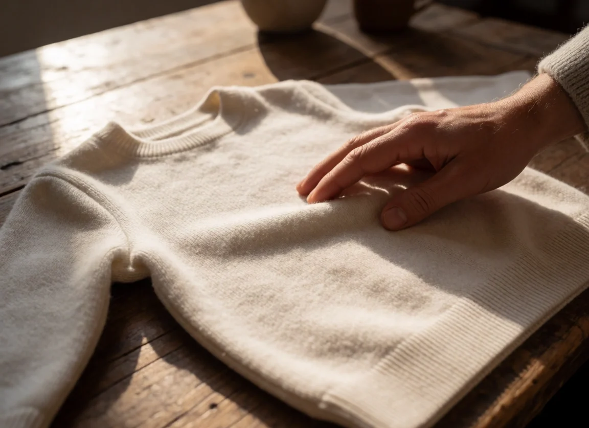
Thankfully, a brilliant new perspective is emerging directly from the next generation of British design talent. A fashion design student in the UK has recently launched an independent clothing line called Hues, which tackles this exact tactile crisis head-on. This is not some highly conceptual runway collection meant to sit inside an art gallery; it is a beautifully practical line of soft, completely seamless, and entirely tagless everyday clothing built specifically for children with high sensory sensitivities. What makes this project incredibly special to me as a fellow young creator is the sheer level of meticulous physical engineering that went into every single garment.
The designer did not just slap a “soft” label on standard cotton blanks. The collection features deeply considered, hidden self-regulation elements built right into the hems, allowing kids to soothe themselves through subtle tactile feedback without drawing any unwanted attention from their classmates. When I first saw the promotional clips showing how these garments stretch and move under stress without losing their shape, I was deeply fascinated by the lack of traditional structural seams. I actually downloaded the source media files and dropped them into a Video Speed Controller online, slowing the footage down to a crawl just to analyze how the knit fabric loops together without creating those awful internal ridges that traditional sewing machines leave behind. It is an absolute triumph of human-centric textile engineering disguised as simple, beautiful casual wear that looks entirely normal from the outside.
Historically, whenever a company attempted to manufacture products for people with specific sensory or physical needs, they stumbled into a massive cultural trap. They created things that looked intensely medical, clinical, and visually isolating. If you needed adaptive clothing or orthopedic support, you were historically forced to wear objects that looked like they belonged in a sterile hospital ward. This approach completely ignores the deep psychological need for social belonging, which is especially cruel and damaging when you are a young child just trying to fit in with your peers at school. No kid wants to wear something that screams “I am different” to the entire playground.

The true genius of the Hues brand lies in its unwavering commitment to the philosophy of universal design. This clothing is not marketed as a restrictive medical device or a niche therapeutic uniform; it is presented as gorgeous, minimalist everyday clothing meant for absolutely any child to wear. By elevating the baseline tactile quality of a standard garment, the designer creates a product that solves a profound, exhausting crisis for a neurodivergent child while simultaneously offering an incredibly comfortable, high-quality piece of clothing for a neurotypical child. True design does not isolate people into neat, bureaucratic categories. It unites them by raising the physical standards of the everyday environment for everyone who interacts with it. We need more of this unified thinking in global fashion brands.
I learned this lesson about material friction the hard way during my brief stint helping an independent creative agency design a trendy, zero-waste vegan cafe in East London. The client was absolutely obsessed with a very specific, ultra-authentic visual aesthetic. They insisted that the entire barista staff wear heavy, unwashed, raw hemp aprons sourced from a small organic farm. On paper and in our initial digital mood boards, it looked spectacular. It screamed sustainability, raw craftsmanship, and earthy integrity. It was exactly the kind of picture-perfect branding that looks incredible on an upscale social media feed.
When you design exclusively for the eyes of the public, you almost always end up torturing the bodies of the people who actually have to live inside your creation.
The opening day arrived, and within less than three hours, our beautiful design concept collapsed into a complete human disaster. The stiff, abrasive raw hemp fabric kept rubbing relentlessly against the back of the baristas’ necks as they moved around the hot espresso machines. By midday, half the staff were sweating profusely, their skin was bright red from severe chafing, and their physical discomfort made them visibly miserable to the customers. I had to personally run out to a local textile shop to buy soft, plain cotton alternatives to save the launch. It was a deeply humbling reminder that if a design object fails the basic test of physical comfort, its visual beauty is completely worthless to the world.
The brilliant launch of the Hues clothing line should serve as a massive wake-up call for designers across every single discipline, whether you are drafting blueprints for public housing, carving wooden chairs, or building digital interfaces. We must actively break away from our dangerous obsession with smooth, flat, hyper-visual perfection. We need to start asking ourselves how our creations actually feel when they collide with the messy, sensitive reality of the human body. Our environments are becoming increasingly sterile and digital, which means our physical possessions must become softer, more comforting, and more deeply grounded in tactile reality.
As creators, our ultimate goal should be to reduce the unnecessary friction of daily life, providing a sense of physical safety and emotional calm through the materials we choose to bring into the world. We need more projects like Hues that challenge the lazy, automated standards of mass production and prioritize the actual sensory experience of the end user. Let us stop building sterile showrooms and scratchy, disposable wardrobes. Instead, let us start designing spaces, objects, and garments that genuinely embrace, protect, and respect the complex nervous systems of the human beings who use them every day.