26
Feb
25
Minimalism in design is about clarity, precision, and removing anything unnecessary. It’s not just a style—it’s a way of thinking. By paring visuals down to their essential elements, designers create works that communicate directly and efficiently. This philosophy can be applied to all aspects of design, from product interfaces to movie posters. Instead of relying on detailed illustrations or complex compositions, minimalism forces both the designer and the audience to focus on the core message.
In education, minimalism is invaluable. It teaches students to identify what truly matters visually and encourages them to eliminate the distracting noise. By working with fewer elements, designers learn to make deliberate choices that enhance readability, recognition, and emotional impact. In a world saturated with images and media, minimal design offers a refreshing way to capture attention with elegance and intelligence.
Simplification is one of the most effective tools for teaching design. When students are asked to distill a concept to just a few shapes, they must analyze the essence of the subject. This process develops visual literacy and strengthens problem-solving skills. By focusing on basic forms, designers explore proportion, balance, and hierarchy without being overwhelmed by details.
Exercises like these are more than academic—they’re playful and exploratory. They provide a safe space to experiment, fail, and learn. Minimalist tasks can make even complicated concepts approachable. As a design mentor, I’ve found that such exercises ignite curiosity and show students that creativity often flourishes under constraints rather than unlimited freedom.
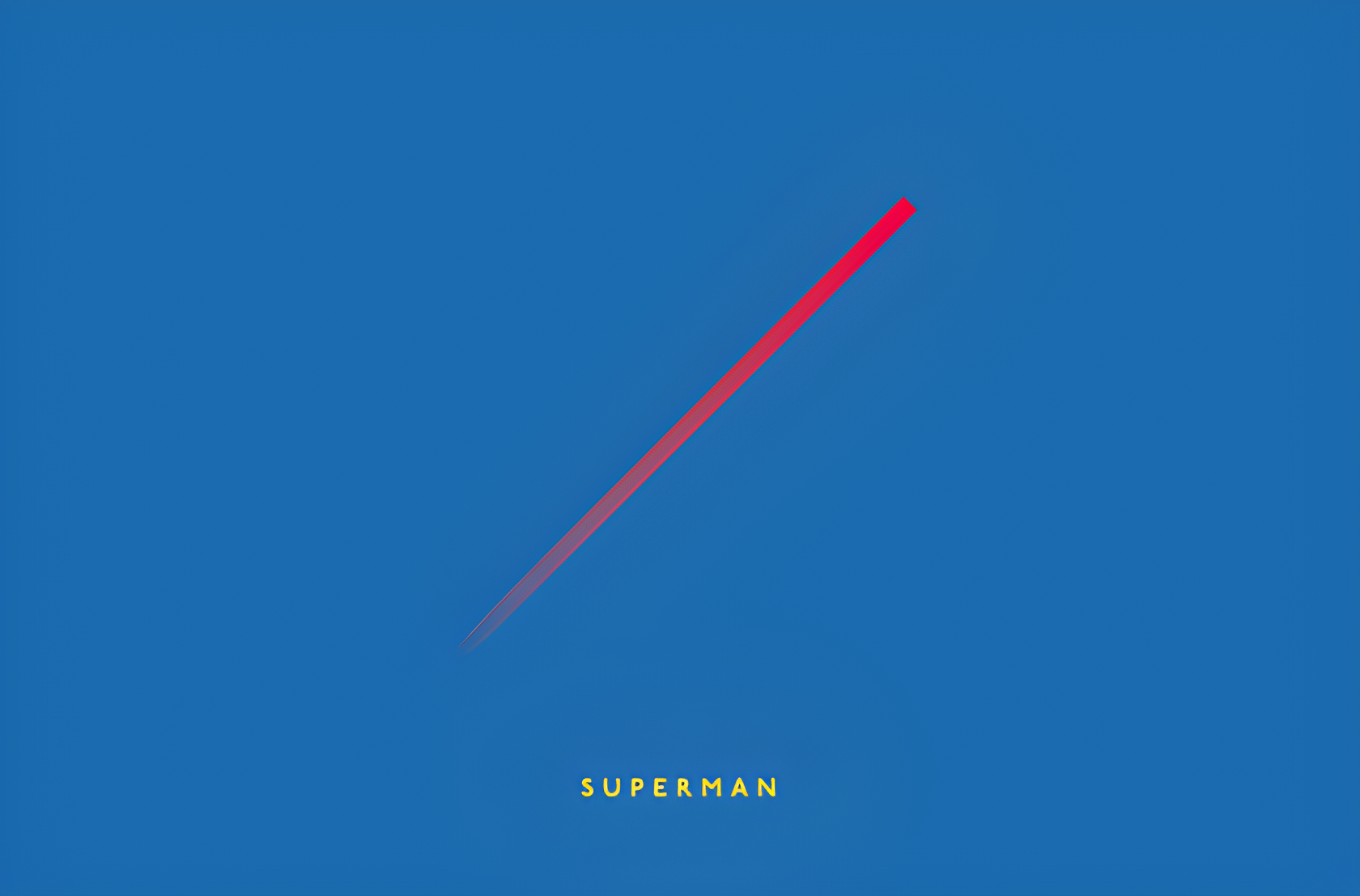
Michal Krasnopolski’s set of minimal movie posters is a brilliant case study. Using just a circle, a square, and two diagonals, he created 22 posters that are instantly recognizable. This simple toolkit demonstrates the power of minimalism in practice. Films like Jaws, Midnight in Paris, and Lord of the Rings are distilled into elemental shapes that capture their essence.


What’s remarkable is how much emotion and narrative can be implied with minimal geometry. A single diagonal line might evoke Superman’s cape, or two intersecting diagonals could hint at conflict or movement. Krasnopolski’s work proves that minimal elements, when thoughtfully arranged, can communicate complex ideas effectively.
Each poster is a study in recognition. The viewer instantly identifies a film despite the absence of typical visual cues. This approach emphasizes cognitive processing and the importance of iconic elements. Minimal design relies on the audience’s prior knowledge, yet it also engages them actively, inviting them to “fill in the blanks” with imagination. It’s an interactive form of visual storytelling.
For designers, this exercise is a lesson in observation. It teaches how subtle changes to shape, position, or orientation can completely alter perception. Understanding the essence of a subject is crucial when creating visuals that are not only simplified but also meaningful.
Limiting the number of elements and colors is not restrictive—it’s liberating. Constraints challenge designers to think creatively, to find unique solutions they might not have considered otherwise. By working within strict parameters, one discovers unexpected forms and compositions. Krasnopolski’s posters illustrate that limitations can enhance ingenuity rather than hinder it.
Applying these principles in other design projects encourages experimentation. When faced with boundaries, designers learn to explore the full potential of minimal tools. The exercise shows that elegance and clarity are often born from restraint and thoughtful decision-making.
Design students and enthusiasts can replicate this approach by choosing simple shapes and attempting to represent complex subjects. Start with three to four basic elements and challenge yourself to convey recognizable forms. Observe how subtle adjustments affect the perception of the design. Discuss your results with peers and reflect on what makes the representation successful or unclear. Such exercises build intuition, discipline, and confidence in design practice.
Another practical tip is to vary scale, color, and orientation of minimal shapes to explore different moods and interpretations. Minimalism doesn’t mean monotony—each small change can yield dramatic effects. These exercises also prepare designers to work on larger projects where clarity and visual economy are paramount.
Minimal poster exercises are not only educational—they’re fun. They combine playfulness with analysis, sparking both creativity and curiosity. In my experience, these tasks often produce the most inventive ideas because they break habitual thinking patterns. Students and professionals alike enjoy the challenge of distilling something complex into elemental visuals.
Minimalism teaches that less is more, and through careful observation, three or four simple shapes can communicate stories as effectively as a thousand details.
Design is as much about joy as it is about skill. Krasnopolski’s posters remind us that even the simplest forms can tell stories, evoke emotions, and inspire learning. Minimalism, when approached with curiosity and care, becomes a powerful tool for both education and artistic expression.