15
Jun
26
We live in an incredibly visual culture where we judge interior architecture almost entirely by its physical materials, dramatic lighting setups, and how impressive the structural geometry looks in professional design magazines. When municipalities commission new community spaces or renovate historic brick-and-mortar facilities, they focus heavily on high-end custom millwork, ergonomic seating, and massive open-plan glass atriums. But as a designer who constantly looks at how real human bodies navigate physical environments, I am deeply exhausted by the absolute lack of digital empathy found in traditional public planning. The modern civic development sector treats website development as an isolated marketing chore, completely separate from the actual spatial experience of the building. This disconnect creates a massive invisible barrier for regular visitors, forcing them to deal with clumsy administrative bottlenecks simply because the digital gateway to the physical assets is broken.
Think about the classic neighborhood library setup. A city pours millions of dollars into a gorgeous building, but keeps a rigid, desktop-only legacy catalog website that was designed twenty years ago. When a resident tries to look up a book title or secure a reservation on their phone while riding the bus, they face an unreadable, non-responsive mess that requires endless pinching and zooming. Frustrated, they give up and show up at the facility in person, immediately joining a long, slow-moving queue at the main desk just to ask a simple logistical question. This clumsy floor congestion completely ruins the calm, open atmosphere the architects worked so hard to create. Traditional space design fails because it ignores the mobile-first reality of modern life, creating physical friction out of pure digital neglect.
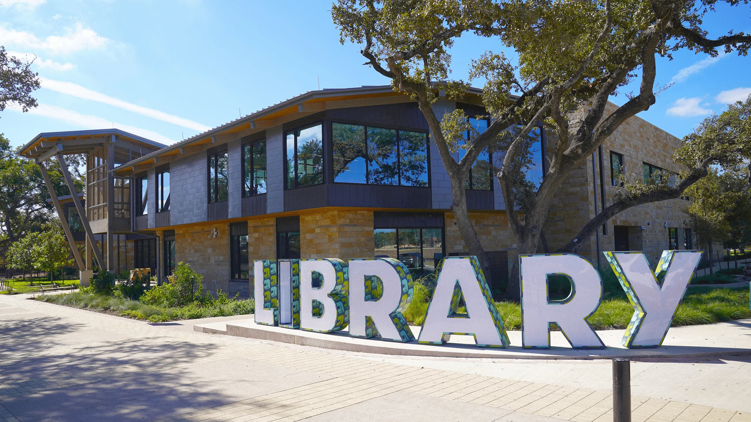
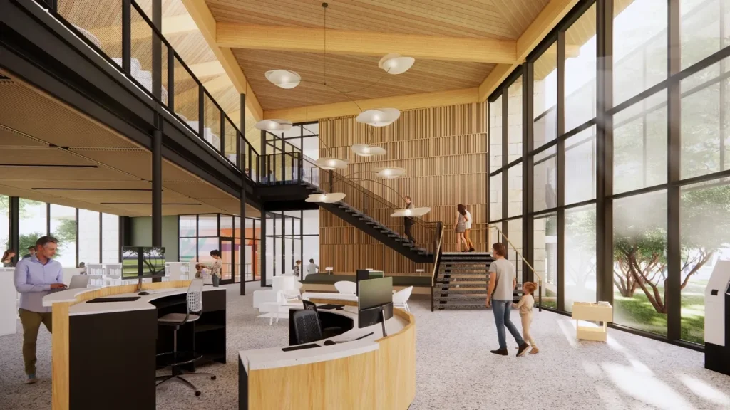
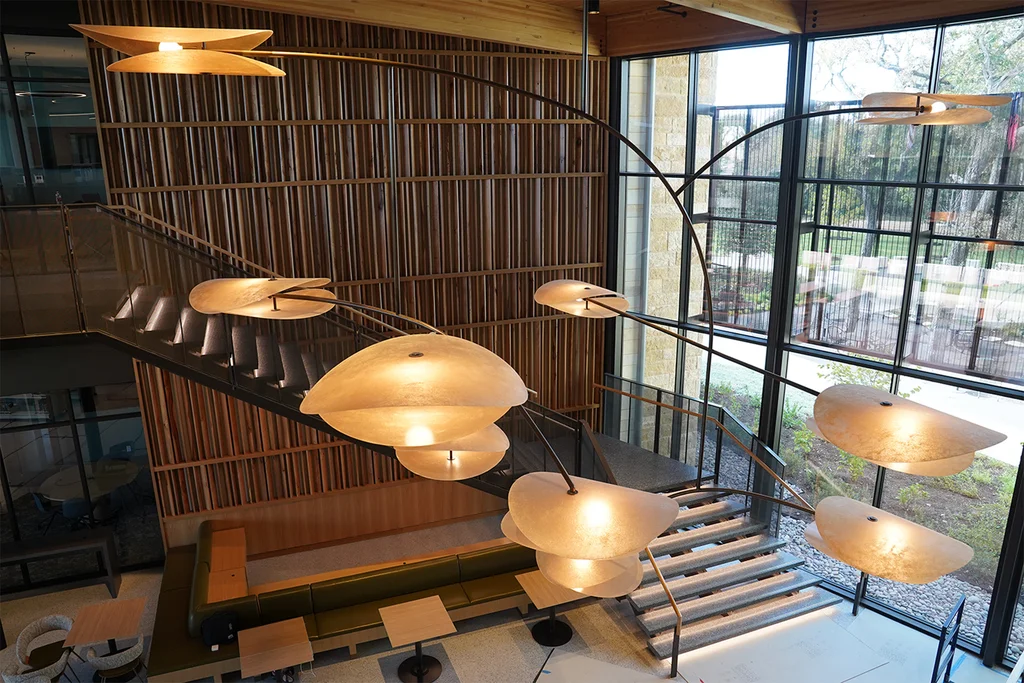
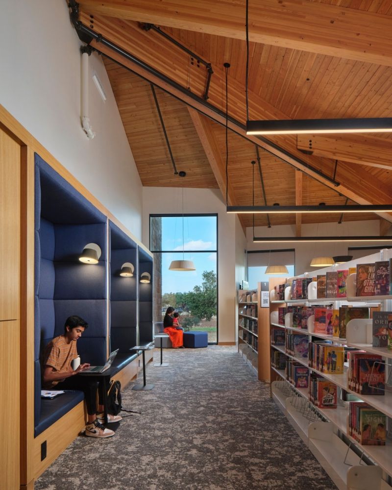
Thankfully, a brilliant and highly practical alternative has shattered this divide in the Austin, Texas metropolitan area. The Cedar Park Public Library recently won a major 2026 Interior Architecture Award, not just for its physical floor layout, but specifically because it integrated a flawless, responsive mobile web system that lets patrons browse, verify, and instantly book materials straight from their smartphones. This project is a magnificent case study in structural synchronization: by building a clean, single-column fluid layout for mobile browsers, the library instantly reduced check-in desk queues by a massive margin. What makes this design so deeply compelling to me as a creator is how it treats frontend code as a literal extension of the building’s physical entryways.
The engineering team did not just install clunky, expensive touchscreen kiosks that crowd the entry halls and require constant hardware maintenance. They focused entirely on optimizing the consumer’s personal device interface, creating flexible CSS grid patterns that automatically adapt to compact mobile viewports. While reviewing the technical wireframes, structural breakdown sheets, and raw text layout documentation sent over by the digital team, I needed a way to translate their clean structural summaries directly into web-ready blocks without dealing with manual syntax retyping. I dropped the copy folders into a browser-based Markdown to HTML converter utility. Running that process allowed me to immediately parse the clean plain-text data into valid semantic elements, keeping the technical documentation completely organized. The underlying layout data proves a critical point: when you make data scannable on a five-inch screen, you completely alter the physical flow of human traffic through a public lobby.
Historically, whenever public institutions attempt to bring technology into their workflows, they fall straight into an incredibly expensive, over-designed trap. They buy flash digital signage boards, heavy custom tablets, and proprietary software packages that drain the limited operational budgets of independent municipal branches. This hardware-heavy mindset completely misses the point of modern UX ergonomics, resulting in broken equipment screens and high technical debt while doing nothing to improve user satisfaction. True structural modernization demands a completely opposite path: it requires lightweight web standards, clean type hierarchies, and highly accessible responsive buttons that can be loaded effortlessly on a cheap phone over a weak cellular connection.
The true genius of the Cedar Park library framework lies in its absolute visual minimalism. The mobile interface drops all heavy corporate graphics, massive imagery banners, and complex multi-tiered menus in favor of a clean, centralized search bar and large, touch-optimized booking elements. The buttons are set to an exact minimum dimension of 48×48 pixels with open spacing, allowing older residents and young children alike to navigate the system without accidental misclicks. By utilizing simple asynchronous background requests, the interface updates a user’s reservation status in real-time without forcing a full page reload, making the digital reservation loop feel as fast and tactile as picking an physical book off a nearby shelf.
I learned a harsh, permanent lesson about the absolute folly of choosing trendy tech hardware over adaptive environmental engineering during a project early in my career helping a design firm build out an open-air transit information pavilion in Melbourne. The lead project director was completely infatuated with a hyper-futuristic, high-gloss visual look. They insisted on mounting a series of massive, expensive interactive touchscreen glass panels directly onto the external concrete pillars of the plaza, which was exposed to direct afternoon sunlight. On our high-resolution computer monitors in the air-conditioned studio, the sleek glass sheets looked like a masterpiece of next-generation civic utility.
When you deploy high-gloss, non-reflective interactive screens directly into unshaded public spaces, solar radiation and natural glare will instantly transform your expensive tech into an unreadable mirror.
The pavilion opened during a bright summer week, and our beautiful concept immediately collapsed into an absolute disaster of physical usability. The blinding glare from the Australian sun made the text on the screens completely invisible to commuters, forcing them to cup their hands over the glass just to read basic schedule lines. Even worse, the intense solar heat baked the touch-sensitive glass layers until the panels became literally too hot to touch with bare skin, causing the internal processors to overheat and shut down repeatedly throughout the day. We had to scrap the expensive custom hardware, build massive overhead steel shade canopies, and replace the units with low-power e-paper displays. It was a deeply humbling reminder that if your digital implementation ignores the uncompromising laws of physical environments and human comfort, it is completely worthless.
The award-winning success of the responsive mobile integration in Texas should serve as a profound structural wake-up call for web developers, interior architects, and municipal authorities around the globe. We must actively break away from our lazy, automated habit of treating digital design and physical design as two separate disciplines that never speak to each other. We need to start realizing that as our urban populations become increasingly reliant on handheld devices, our public buildings must adapt to provide fluid, unified experiences that respect the user’s digital habits. A library website should never be an unreadable digital obstacle; it should be an open, responsive pathway that makes accessing public knowledge completely effortless.
As creators, our ultimate objective should be to eliminate the unnecessary visual and material friction of our shared public landscapes, providing a deep sense of structural order, accessibility, and community pride through disciplined layout choices. We need more localized public works projects that challenge the lazy, unchanging templates of corporate system design. Let us stop forcing citizens to stand in unnecessary, slow-moving lines behind bulky wooden service counters. Instead, let us start engineering smart, mobile-first, and highly adaptive public systems that genuinely honor, protect, and support the daily movements of the human beings who fill our modern cities.