11
Jul
25
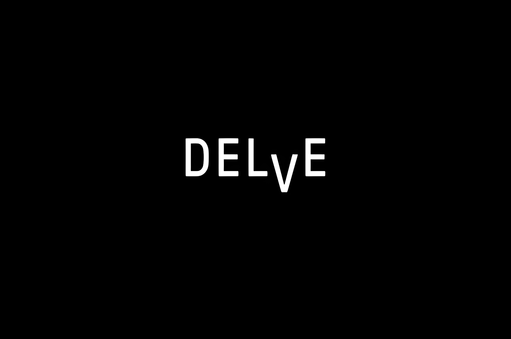
There was a time when every brand needed a fixed logo — something to print, to stamp, to own. But in the last decade, visual identity has moved into a different world. Delve’s approach to design captures that shift perfectly: instead of creating one unchangeable symbol, it builds a language that can be spoken in many ways.
When I first saw the Delve identity, I thought it was incomplete — too light, too restrained. But the more I looked, the more I realized that’s the point. It’s not about visual dominance; it’s about structural presence. The consistency comes not from the mark itself, but from the system behind it — the grid, the layering, the rhythm of transparency. It’s design that whispers, not shouts.
Delve’s designers built their identity around the idea of layered communication. Every piece — from typography to motion — exists within a system of translucent planes that interact. The result feels less like branding and more like choreography. The identity breathes, shifts, and balances between precision and fluidity.


In this system, color plays a secondary role. Structure is the hero. The transparent rectangles and their modular rhythm suggest openness — a visual metaphor for curiosity and exploration, which aligns perfectly with Delve’s product philosophy. It’s branding as visual thinking, not surface decoration.
Delve’s grid isn’t just an aesthetic choice; it’s a behavioral framework. The design team treated every visual decision as a question of logic: how should space behave when new content arrives? What does consistency mean when the product itself is dynamic? The outcome is an identity that adjusts in real time — a brand that feels alive, responsive, and intelligent.

I’ve noticed similar tendencies in contemporary design studios in London and Berlin. There’s a growing shift from static graphics to kinetic systems. The Delve identity belongs to this new movement where branding isn’t an artifact but an algorithm — a set of rules that creates visual harmony.
What fascinates me most about Delve is that it doesn’t look “finished.” That unfinished quality is intentional — it keeps the brand open to change. The designers built a system that welcomes imperfection and evolution. It’s like watching an organism grow rather than a logo being stamped everywhere.

When I worked on furniture design, I used to think of structure as limitation. Now I see it as freedom — the same way Delve treats its grid. The system gives direction but leaves space for personality. This is the kind of flexibility modern identity design demands: consistent in logic, variable in expression.
Design today isn’t about logos. It’s about creating systems that think — and Delve’s identity might be one of the cleanest examples of that shift.
Delve’s system shows how identity design is becoming more about philosophy than marketing. It’s less about how a brand looks and more about how it behaves. That behavioral shift is crucial — audiences now recognize authenticity in movement, not in repetition.


There’s a certain calm confidence in Delve’s visuals — a feeling that the brand doesn’t need to perform to be understood. Maybe that’s the ultimate sign of maturity in design: when clarity replaces noise, and structure replaces spectacle.