19
Oct
18
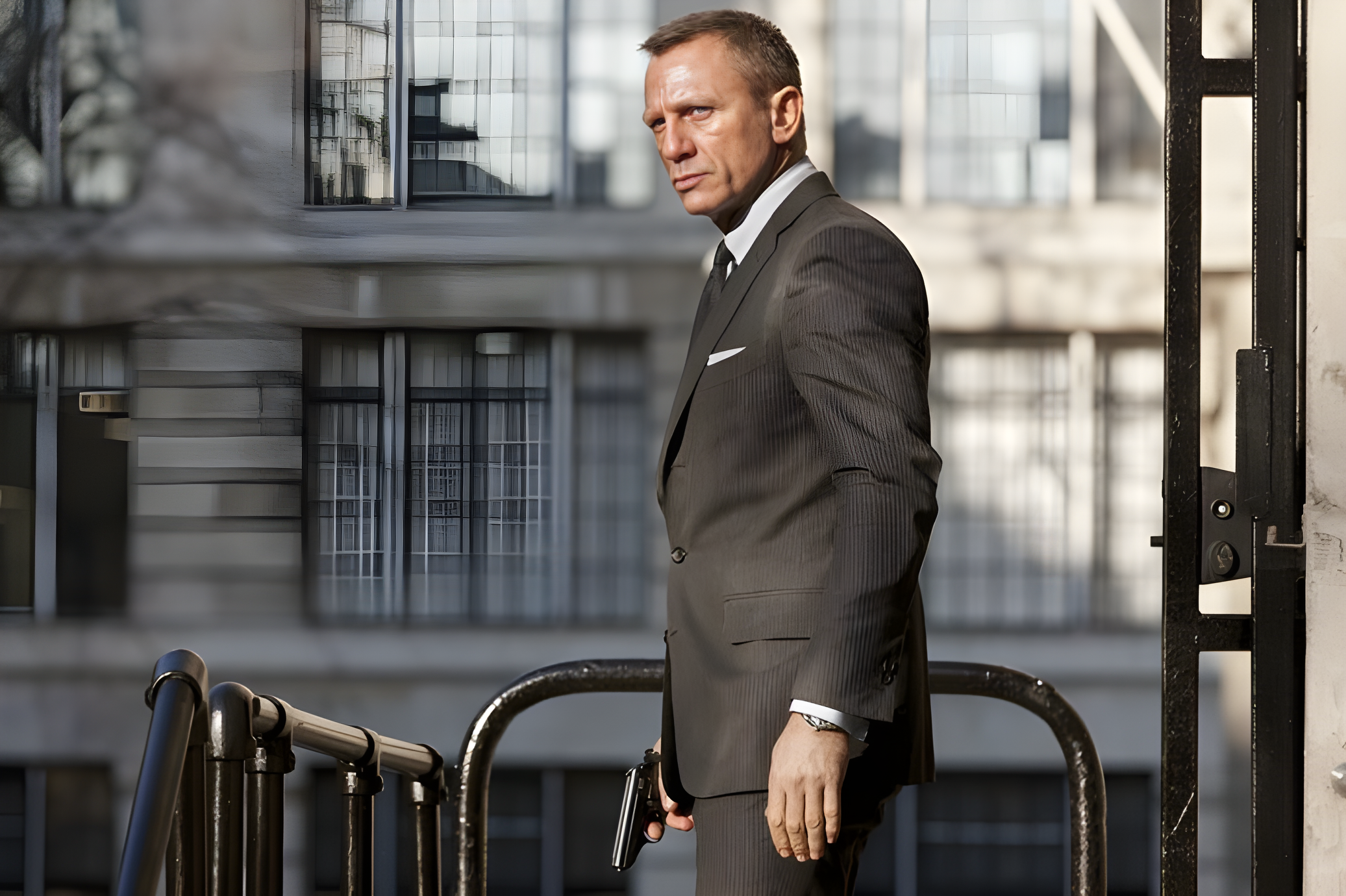
Skyfall is a visual marvel. From the opening scenes to the climactic sequences, each frame carries a painterly quality. The cinematography, largely executed by Roger Deakins, brings every environment to life — whether it’s the sprawling Scottish highlands or the intricate details of MI6 headquarters. Light, shadow, and composition work in tandem, making the movie visually immersive. Yet, despite this near-perfection, some tiny details feel slightly off, reminding us that even masterpieces have imperfections.
The film’s pacing and scene transitions are impeccable, giving viewers moments to breathe while soaking in the drama. Color grading maintains a consistent mood, reinforcing tension and elegance. Costume design, courtesy of Tom Ford, further enhances the sophistication of Bond, reflecting both the character’s timeless style and the modern luxury of his world. Every prop, vehicle, and gadget appears deliberately chosen, echoing decades of franchise legacy. However, these highly polished elements only make the subtle missteps more noticeable for those paying attention.
Javier Bardem’s portrayal of Silva is arguably the film’s strongest pillar. His nuanced expressions, combined with a chilling sense of purpose, elevate Skyfall beyond a typical Bond villain. The interaction between Silva and Bond highlights the delicate balance of tension, intellect, and unpredictability that makes a villain memorable. The supporting cast, including Judi Dench and Naomie Harris, further solidifies the film’s narrative integrity, adding depth and gravitas.
Costumes and styling aren’t merely decorative; they communicate character. Bond’s tailored suits and subtle accessories signal authority and elegance, while Silva’s unconventional wardrobe hints at chaos lurking beneath control. These visual cues, though subtle, contribute to storytelling. Yet, in a movie obsessed with detail, a minor oversight — like inconsistent typography in title cards — creates a jarring contrast, momentarily pulling the audience from the cinematic experience.
Even a Bond film deserves flawless design execution, including typefaces.
One of the most noticeable missteps lies in the film’s typographic choices. For a franchise synonymous with sophistication, the use of Copperplate Gothic for certain titles feels mundane and out of place. Typography is often overlooked in cinematic critique, but in a film built on visual storytelling, it carries weight. Titles should complement the narrative, not distract from it. A single typographic inconsistency can subtly alter audience perception, undermining the elegance painstakingly built elsewhere.
Design-conscious viewers immediately recognize these nuances. While general audiences might miss them, anyone attuned to visual communication senses the discord. Even the ‘Macau’ title card demonstrates how a small design choice can affect immersion. In essence, Skyfall reminds us that no detail, however minor, is truly insignificant in comprehensive design execution.
Skyfall’s minor design oversights illustrate a broader truth: the devil is in the details. Every visual element contributes to storytelling. Whether it’s a vehicle, costume, or title card, each component must harmonize. Inconsistent typography, subtle lighting anomalies, or misaligned props can slightly detract from audience engagement. Designers, filmmakers, and choreographers alike must understand that the overall experience relies on both grand and minute details working in concert.

These details might not always be consciously noticed, but they subconsciously shape audience perception. For example, the difference between a perfect frame and a slightly flawed one can influence emotional responses, making suspense more or less effective. In Skyfall, while almost everything is executed flawlessly, these small missteps serve as reminders that true perfection demands unwavering attention to every element.
As a long-time Bond fan, expectations are sky-high. Skyfall delivers nearly every aspect one could desire — thrilling action, compelling characters, and breathtaking visuals. Yet, our expectations amplify the impact of even minor flaws. It’s not about criticizing the movie for the sake of it; it’s about recognizing that perfection is built on consistency. Small errors, like typographic choices, remind viewers that even masterpieces are crafted by humans susceptible to oversight.
Fans and designers alike experience this dichotomy: the thrill of excellence juxtaposed with disappointment over tiny, avoidable mistakes. Skyfall’s brilliance is unquestionable, yet it also serves as a case study in why meticulous attention to every component matters. For Bond aficionados, the difference between ‘almost perfect’ and ‘perfect’ can be significant, especially in a franchise that celebrates style and precision.
Skyfall teaches an invaluable lesson: excellence in design and filmmaking is holistic. From character design to typography, from lighting to costume details, every element must resonate. Minor oversights, while seemingly trivial, influence perception and emotional impact. For designers, filmmakers, and visual storytellers, the film exemplifies the importance of aligning all components. Cohesion is key; even the subtlest detail contributes to the overall narrative.
In reflecting on Skyfall, one realizes that perfection is iterative. Learning from small design missteps enhances future creative endeavors. While Skyfall remains a cinematic triumph, its imperfections offer fertile ground for discussion, analysis, and inspiration. Recognizing and addressing tiny flaws ensures that next time, both viewers and creators can achieve the elusive goal of flawless storytelling.