28
Feb
24
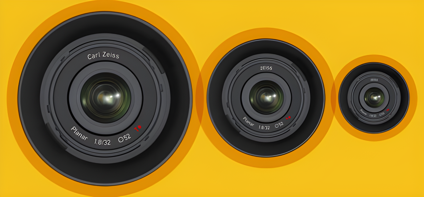
Brand names carry history, and history carries baggage. For legacy technology houses like Carl Zeiss, the full name evokes founding stories, craftsmanship and a lineage stretching back more than a century. But that historical gravity is also a marketing friction: long names fragment across product lines, inconsistent logos and multiple regional usages. Over time, what started as a mark of pride can become a source of noise.
In a marketplace that prizes clarity — especially in professional optics, industrial systems and software-driven instruments — simplicity wins. The move to a single, compact brand identity is not merely cosmetic. It’s a strategic decision to reduce cognitive load for customers and to present one confident face across wildly different business units: camera lenses, surgical microscopes, metrology systems and solutions for semiconductor manufacturing. For designers, this is interesting because it underscores a perennial tension in branding: respect the past, but design for the future.

Companies from Kodak to Pentax have done similar truncations in the past when the market demanded a clearer, more flexible identity. In ZEISS’s case, the change is also about how people talk. When professionals casually call something “Zeiss,” the brand loses the “Carl” almost by usage — and ZEISS made that usage official.
When ZEISS announced the consolidated brand usage — moving from “Carl Zeiss” in many contexts to a single “ZEISS” — it framed the decision as a clarity-and-consistency play. The company’s communications explained that ZEISS would be used wherever possible to eliminate the lack of consistency caused by alternating uses of “Carl Zeiss” and “Zeiss” across products and regions. The formal corporate entity remains Carl Zeiss AG in legal terms, but outward-facing product and marketing materials increasingly use ZEISS as the name consumers and partners see.
That shift was rolled out alongside product launches — Touit lenses being an example at the time — and gradually echoed across press materials and packaging. Practically speaking, some older products kept existing branding to avoid confusing customers mid-cycle, while new products and campaigns pushed the ZEISS visual identity. For designers and marketers, this is a textbook example of phased rebranding: keep legal continuity, update external touchpoints incrementally, and align partner messaging.
ZEISS isn’t just a camera-lens label. Its portfolio spans clinical microscopes, planetarium optics, metrology stations used in semiconductor fabs, and eyeglass lenses. That diversity is both a strength and a headache when it comes to identity. Imagine a single corporation whose name appears on a consumer smartphone camera, on surgical instruments in operating theatres, and on measurement gear calibrating chip production. Each touchpoint carries different expectations about precision, certification and visual language.

Using ZEISS consistently across all these domains helps the brand speak one design language. It simplifies typography, color systems and tone. For product designers, this uniformity means the mark can be made smaller, applied predictably and scaled across digital and physical touchpoints. It also aids cross-selling: a client who trusts ZEISS in microscopy may be more inclined to explore ZEISS metrology solutions because the identity cues match.
Nothing about a rebrand happens in a vacuum. ZEISS historically licensed its optics for cameras in phones and imaging devices; the Carl Zeiss mark has appeared on many co-branded products. One practical question was whether ZEISS’s new naming would propagate to third-party licensees. In many cases, legacy agreements and supply-chain realities required careful, negotiated transitions. Co-branded products already on shelves couldn’t be relabeled overnight, and partner marketing had to reflect both legacy recognition and new identity.
Take the smartphone example: the Nokia Lumia 1020 and similar devices carried the Carl Zeiss or Zeiss optics name prominently. Later partnerships — for instance, ZEISS renewing collaborations with Nokia/HMD — continued to emphasize optical excellence but under more consistent ZEISS branding. For product managers, the lesson is clear: rebranding must be synchronized with partners, contractual obligations and packaging cycles, otherwise market confusion will eat any intended benefits.
Brand truncation isn’t novel. Kodak shortened to KODAK in many visual uses over decades; Pentax and others simplified their product logos for clarity. The motivation is practical: shorter, bolder marks work better in tiny digital spaces and on small device bezels. They also translate more cleanly into different scripts and cultural contexts. A compact brand name is easier to trademark globally, easier to animate in a UI, and easier to remember.
But there are trade-offs. Removing a founder’s name can be perceived as erasing heritage or as a cold pivot toward modernity. Successful transitions tend to respect the legal and narrative history while shifting the experiential identity. ZEISS managed this by keeping Carl Zeiss AG as the legal entity while presenting ZEISS as the customer-facing brand. It’s subtle, but important — heritage is preserved without constraining the brand’s modern expression.
From a designer’s perspective, brand consistency matters more than ever. In a world of thumbnails, app icons and product thumbnails, an inconsistent name fragments trust. When every touchpoint — from a smartphone camera UI to an industrial microscope’s control panel — uses the same mark, it transmits a promise of uniform quality. Visual consistency is a kind of usability: it reduces friction, lowers cognitive load and helps professionals make faster, trust-based decisions.
There’s also a symbolic side: a single, confident ZEISS mark signals technological seriousness. For users choosing lenses, the mark becomes a quick heuristic for expected optical performance. For industrial buyers, consistent branding is shorthand for reliable support networks and unified documentation. In the age of subscription services and platform ecosystems, that shorthand is valuable.
By 2025, the logic behind ZEISS’s simplification looks prescient. Devices have proliferated, interfaces shrunk, and audiences fragmented across industries. Simplified, bold brands adapt better to small screens, AR overlays, and smart-device UIs that demand concise typography and clear icons. The rebrand wasn’t mere vanity; it was infrastructure for the future of product experiences.
ZEISS will be used as much as possible in the future to eliminate the lack of consistency in how Carl Zeiss and ZEISS are used.
For designers and product people, ZEISS’s move is a reminder: design decisions at the brand level ripple down into materials, interfaces and partner ecosystems. The best brands understand that typography, spacing and naming are part of a product’s functional toolkit, not mere decoration. ZEISS chose clarity over nostalgia, and that choice helps the company remain legible and relevant across a dizzying array of high-precision fields.