29
Jun
26
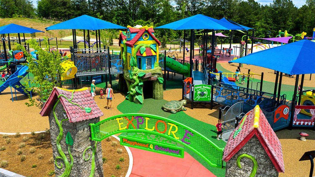
We live in an incredibly visual culture where we judge public infrastructure by how sleek, geometric, and artistic it looks from a distance. When developers sketch out new residential neighborhoods or urban parks, they pour massive budgets into monumental climbing towers, towering twisting slides, and complex elevated networks of ropes. But as a designer who has worked across furniture, interiors, and commercial advertising, I am constantly frustrated by the absolute lack of empathy embedded in these structures. These high-altitude architectural marvels look stunning in a real estate brochure, but they represent a form of aggressive spatial segregation. They are built for an incredibly narrow definition of the human body, effectively exiling anyone who moves, sees, or processes sensory data differently.
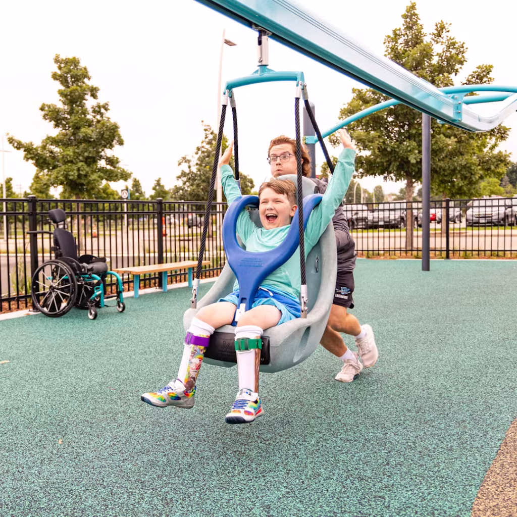
For decades, accessibility in park design was treated as a lazy, bureaucratic box-ticking exercise. A town council would install an enormous, inaccessible timber fortress and then bolt a single, lonely plastic panel or a clunky, clinical wheelchair swing in a distant corner of the grass. This approach does not foster community; it highlights isolation. It tells disabled children that the core, exciting parts of public life are completely barred to them, while they are relegated to a separate, substandard zone. The modern urban playground has fundamentally failed families by failing to recognize that play is a universal human right, not a luxury reserved exclusively for the able-bodied. We desperately need to stop designing for dramatic vertical scale and start focusing on the horizontal richness of the ground beneath our feet.
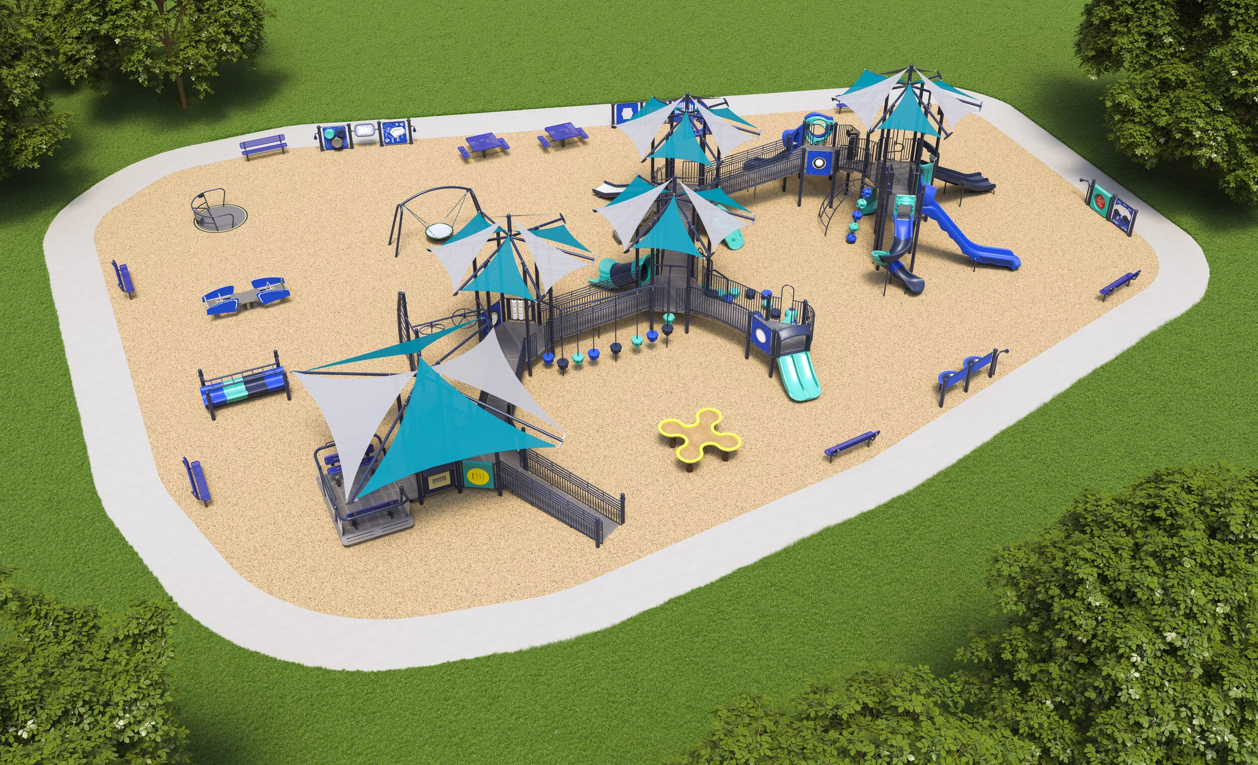
Thankfully, the global conversation around public infrastructure is undergoing a massive, long-overdue structural transformation. New progressive municipal design frameworks are establishing a radical new baseline for community play areas. The current standard demands that a minimum of fifty percent of all physical play equipment must be completely accessible at the ground level, integrated seamlessly alongside smooth, gentle grade transitions rather than steep, terrifying steps or industrial-looking metal ramps. What makes this paradigm shift so beautiful to me as a creator is that it completely abolishes the visual hierarchy between adaptive equipment and standard play structures.
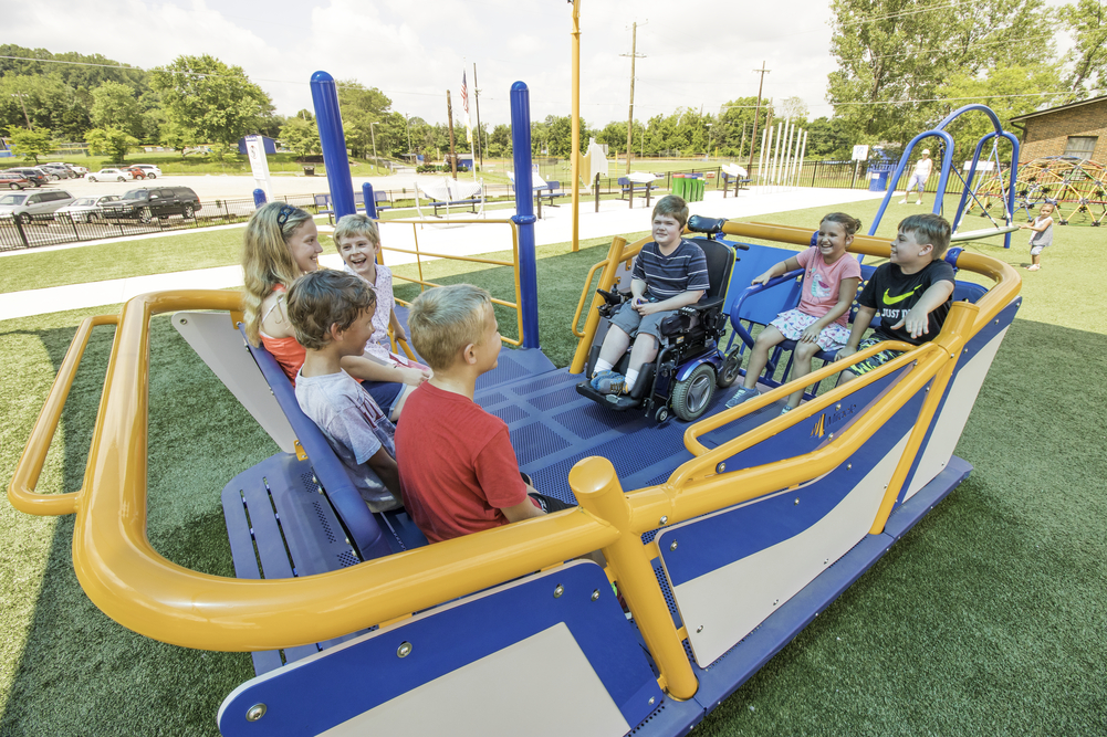
The layout forces industrial designers to rethink how a play feature works. Instead of hiding sensory panels or interactive elements at the top of a massive deck, they must be built directly into the foundational landscape. When analyzing layout schematics for these new open-access parks, I often find myself reviewing complex topography maps to see how different play zones connect. I regularly save these design blueprints as high-resolution images and run them through an online Image Compressor to keep my project archive organized without bloating my local drive. What this digital analysis reveals is brilliant: by bringing fifty percent of the high-value interactive components down to earth, we create an environment where a child in a wheelchair, a child with low vision, and a neurotypical toddler can play side-by-side on the exact same structure without any physical boundaries separating them.
Historically, whenever a public space attempted to become sensory-friendly, designers fell into a trap of intense over-stimulation. They blanketed surfaces in blinding neon colors, installed chaotic, loud musical pipes, and covered every square inch in confusing, contrasting plastic textures. This chaotic approach completely ignores the neurological reality of conditions like autism or sensory processing disorders, where high-contrast visual and auditory noise triggers intense anxiety and mental exhaustion. True accessibility requires a delicate balance between active stimulation and quiet, predictable spatial navigation.
The true genius of the current design movement lies in the sophisticated application of tactile guidance systems for visually impaired and blind children. Instead of relying on bright, ugly warning paint, modern landscapes utilize natural materials with varied physical properties to communicate boundaries. A smooth poured-rubber pathway might run directly alongside a deeply textured, brushed stone border or a soft wood-bark zone. These physical transitions act as a highly intuitive, non-visual map that a child can easily read through the soles of their shoes or the tip of a cane. This is not medicalized design; it is elegant, quiet engineering that improves the spatial awareness and physical autonomy of a child without screaming for attention or ruining the organic beauty of the landscape environment.
I learned a brutal lesson about the dangers of prioritizing pure, unyielding visual aesthetics over human physics during my second year collaborating with a landscape firm on a public park renovation in the UK. The lead architect was absolutely obsessed with achieving a hyper-modern, sculptural aesthetic. They insisted on installing a series of custom, mirror-polished stainless steel slides embedded directly into an artificial grassy hill. On paper and in our digital rendering software, it looked like absolute genius. It was a beautiful, reflective ribbon of silver slicing through the vibrant green topography, catching the evening sun perfectly.
When you design a public object purely for the architectural camera lens, you almost always end up creating a hazardous environment for the actual human beings who have to use it.
The playground opened during an unusually warm summer week, and our beautiful, artistic concept immediately turned into a total disaster. The polished steel surfaces acted like giant solar mirrors, heating up to temperatures that could easily burn a child’s skin within seconds. Furthermore, the blinding glare reflecting off the slides made it completely impossible for children with low vision or light sensitivity to navigate the surrounding pathways safely. We had to immediately shut down the multi-thousand-pound installation and wrap the slides in canvas covers until we could sand down the metal to a dull, matte finish. It was a deeply humbling reminder that material behavior in the real world must always dictate form, especially when the safety of children is on the line.
The widespread adoption of these inclusive playground standards should serve as a massive wake-up call for designers across every single creative industry. We must actively reject the lazy assumption that universal accessibility is an expensive, restrictive chore that stifles artistic expression. In reality, designing for the full spectrum of human ability forces us to be infinitely more creative, thoughtful, and rigorous in our work. We need to stop building public spaces that cater exclusively to the young, agile, and neurotypical while treating everyone else as an administrative afterthought.
As urban creators, our ultimate goal should be to design public landscapes that foster a deep, unshakeable sense of collective human belonging. By building spaces with smooth transitions, tactile pathways, and equitable ground-level engagement, we create communities that are fundamentally more gentle, welcoming, and connected. Let us stop constructing sterile, exclusionary monuments to visual perfection. Instead, let us start engineering rich, sensory-grounded environments where every single child, regardless of their physical or cognitive abilities, can step out onto the playground and feel that the world was built with their presence in mind.